So here we go... I'm not a professional photographer and this is a real house not a pinterest perfect house so go easy on me ;)
This is what you see right when you walk in the door. His room is in the front of the house and is one of the rooms that gets the most natural light.
I had a really hard time deciding where to put the crib. Matthew's room is bigger than Miller's but I found the furniture placement much harder with those windows. My mom is the one who ultimately decided to put it against the windows and I love it.
I had been struggling with what to put over the crib when my sister in law gifted me this star print below. I absolutely love it and it's perfect.
We love our Jenny Lind crib so far. To be honest we rarely use it since Matthew still sleeps next to our bed but it was easy to put together. Much easier than the one in Miller's room from Pottery Barn Kids and it was half the price! So those are both wins in my book.
Matthew's stuffed animal collection. Miller has about 6 stuffed animals that he takes to bed every night so I will interested to see if Matthew is the same way. Miller has already tried to steal all of them.
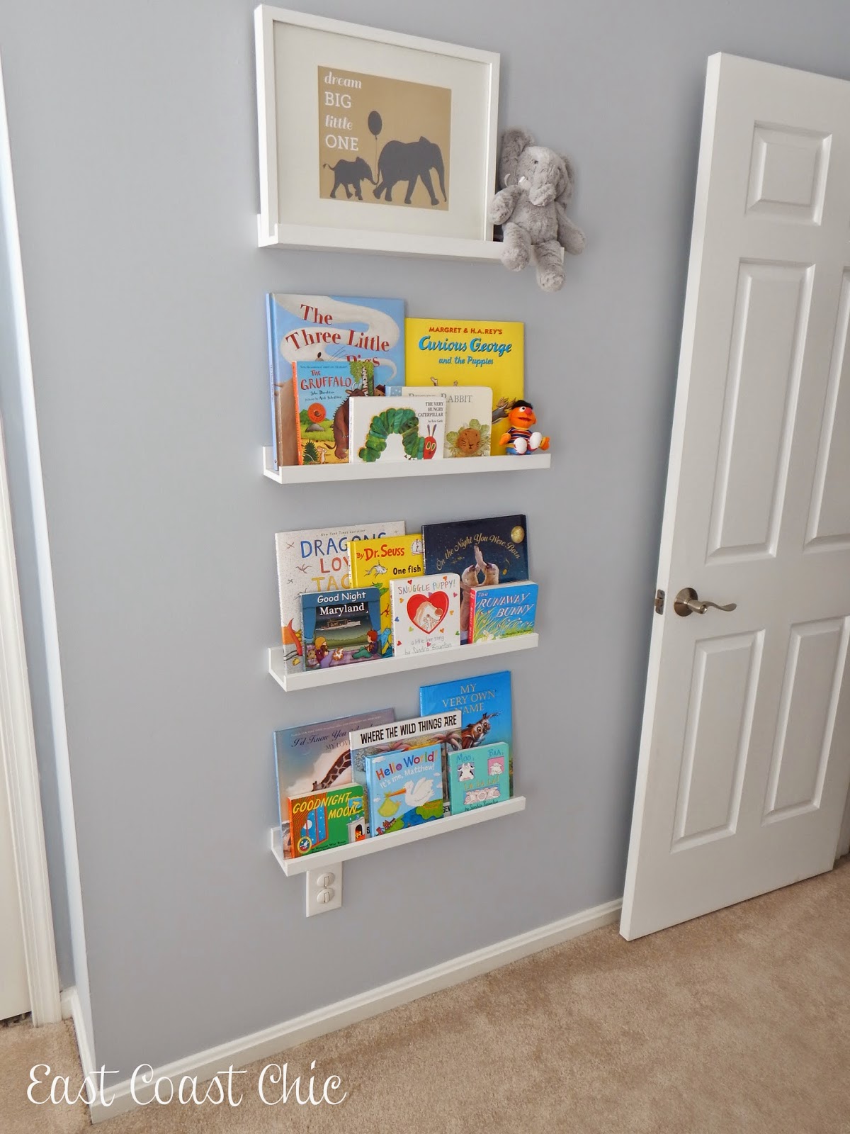
This might be my favorite wall in the room! I love how it turned out and how easily accessible the books are. I wish I had done this in Miller's room.
The books are all ones I've either purchased or been gifted from Miller and Matthew. I moved a lot of the ones Miller was tired of in here :)
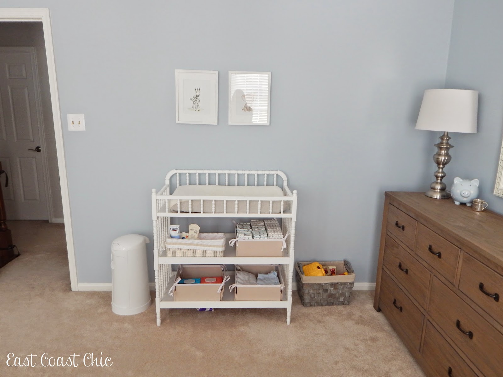
In Miller's room I used an Hemnes dresser for a changing table but this time I decided to go with a traditonal changing table. I think there are pros and cons to each option. The one thing I will say is that I do miss having the drawers because Miller's busy little hands love to dump out everything in those baskets!
I orginally wanted prints from Animal Print Shop but I had seen them in so many nurseries lately I decided to look for something different. I found these prints on Etsy and they are perfect!
Top left: lotion, wipes, and diaper rash cream. Top right: Diapers- we are loving the Honest ones for Matthew and they're all left over from Miller
Bottom left: Exta wipes. I'm obsesed with Targe Up&Up wipes in unscented or sensitive skin
Bottom right: Diaper pad cover, burp clothes, etc.
This is a toy basket of Miller's toys to keep him busy when we're upstairs in Matthew's room. So far it's worked out really well and he knows those are his special toys :)
This laundry basket is my favorite! I bought one of these huge bags for Miller and at first I thought it was way to big for baby laundry but I quickly realized it was not. Babies have a lot of laundry. I decided to get the same one for Matthew in another color and it's been perfect. It's a large floor tote from Pottery Barn kids that I had laundry embroidered on. I linked to it below.
Matthew's shoe collection is handing down from Miller and a lot of those were handed down to Miller from my nephew.
So there you have it! I am really happy with how the room turned out and it's currently my favorite room in the house (probably because it's the only one that stays clean and organized). It actually turned out much bluer than I expected but I've ended up loving the blue color and think it fits Matthew's personality perfectly. Since I know everyone always wants to know I included the sources below but if you have any other questions feel free to ask!
Sources:
Paint color: Benjamin Moore Mt Rainer Gray
Crib: Davinci Jenny Lind
Crib sheet: Restoration Hardware
Crib skirt: Restoration Hardware
Print over crib: Gift
Dresser: Restoration Hardware Baby & Child
Rocker: Pottery Barn Kids
Stool as side table: old from Homegoods
Prints and framers over rocker: Old from Antique sale
Changing table: Davinci Jenny Lind
Changing pad cover: Restoration Hardware
Cloth Baskets in changing table: Pottery Barn Kids
Wood Basket in changing table: Pottery Barn Kids
Prints over changing table: Etsy, Trafalgar's Square
Book shelves: Ikea Ribba
Laundry Basket: Pottery Barn Kids
Lamp, mirror, decor on dresser, and deer head: old from Homegoods


i love it! the paint color is perfect and those animal prints are super cute. xo jillian - cornflake dreams
ReplyDeleteI love it! The wall color is absolute perfection, the art is all amazing, and the wood is such a great color! I like the color of the frames because they pop against the wall. I also love the book wall! Such a great nursery!
ReplyDeleteWe have the same crib and I love it! You can't beat the classic look and the price.
ReplyDeleteIt's perfect!!! The blue is beautiful and I love all of the little details--especially the star picture :)
ReplyDeleteThe nursery looks amazing and I love that picture of Matthew- he is too precious!! And I agree with you about the frames- a lighter tan/beige color would look great! xo
ReplyDeleteIt's wonderful! Love the wall color and how you've organized it. The book wall and the baby animal prints are my favorites. That first picture of Matthew in his crib is absolutely darling. So cute!
ReplyDeleteObsessed with this room!!! I think it turned out fabulous! I also think the f tames go well with how they are painted now. Oh and what a fabulous idea to have a bin for Miller! I might have to use that idea too!!
ReplyDeleteLooks great! Love his dresser. I need a new laundry basket. Mine has seen better days and is falling apart.
ReplyDeleteWhat a great nursery! I love how deep the window sills are, and I love the crib placement! Good job, Momma!!
ReplyDeleteI loveeeee it! It's so classic and preppy, totally up my alley! And I love that the crib looks vintagey
ReplyDeleteOh my goodness it's perfect! I just love the colors! Those animal prints are adorable! Please tell me where you found all the cute shoes for Mathew? I have been struggling trying to find good shoes for Camden.
ReplyDeleteSooo cute!! I love it all!!
ReplyDeleteI adore it! The colors, those windows (swoon), the reading wall, and even the basket of toys for the older brother...genius! Great job!
ReplyDeleteSo sweet! Love the book shelves!
ReplyDeleteOh my gosh I love this! It just looks like such a peaceful, happy place! Love all of the colors and the wall art! I actually really like that color on the frames because it really pops and creates a nice contrast with the wall and the chair. Beautiful job!
ReplyDeleteIt's beautiful! I love those windows - what a great way to showcase the crib! I really love the color of the frames and the dresser is stunning. He is precious too - that sweet smile!! I love your laundry bin - I purchased another style from PBK and it's finally reached the end of its usefulness (at 7 years!). I need two new ones now!
ReplyDeleteIts incredible! I love it!! Especially the perfect paint color!!! xx
ReplyDeleteI love love love it! Especially that gorgeous dresser!
ReplyDeleteSuch a sweet room! I love, love the color!
ReplyDeleteNatalie! It looks perfect! I'm obsessed with the color on the walls and the Jenny Lind crib and changing table. You know we are big fans of the Jenny Lind :) I love the way the room came together and all the soft touches. I am definitely planning on doing those book shelves in Brodys toddler room and will do something besides our dresser for a changing table in the nursery for our next baby too. Our dresser is just too tall for a good changing station. You did such an awesome job!!
ReplyDeleteOh my gosh - first of all he is such a cutie!!! His room looks GREAT!!! Well done! :)
ReplyDeleteHis room is so adorable!! I love the paint color and all his little shoes :)
ReplyDeleteIt looks lovely! You did a fantastic job, and it is Pinterest worthy! :)
ReplyDeleteso cute! Esp the unique prints from the book! Love that idea.
ReplyDeleteFor your frames - I'd suggest a dark gray instead of the beige- I think the dark color would bring out the different colors in those great prints! Good luck!
ReplyDeleteSuch a great space. I love how soft it is and all of the special little touches around the room - great job!!
ReplyDeleteWhat a sweet room! I really like the crib between the windows- excellent idea on behalf of your mom!
ReplyDeleteI love how bright the room is!! The colors you picked are so perfect!! xo, Biana - BlovedBoston
ReplyDeleteOh what a sweet and beautiful little space! You did a wonderful job (and your pics are fab), love this!
ReplyDeleteThis is such a tranquil and sweet space! I love the mix of white and light wood, too. Great job, lady! The crib shots of M. didn't hurt, either ;)
ReplyDeleteI absolutely love this! It's calming and yet gets such great natural light. Beautiful job on all of the details!
ReplyDeleteAbsolutely love this!!! The wall color is amazing!
ReplyDeleteI love everything about his room! It feels so soft and inviting! I wish I'd gone with shelves instead of bookshelves for the girls because they end up staying much neater. I'd probably go with a lighter shade for the frames or even a weathered grey.
ReplyDeleteHe has a lot of shoes! Lol!
ReplyDeleteI think it looks great!
ReplyDeleteI love that color scheme...so calming! I agree the steamboat frames would be better in a more neutral tan and Iove, love the zebra and elephant print!
ReplyDelete